Location: Los Angeles, California
Existing Conditions
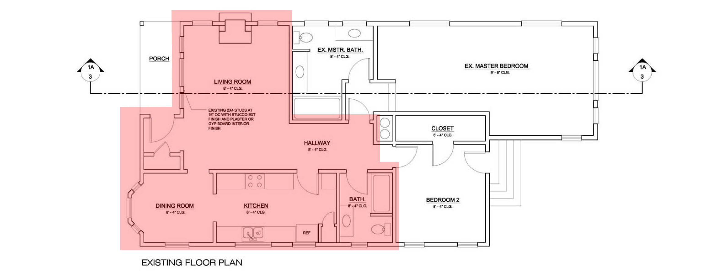
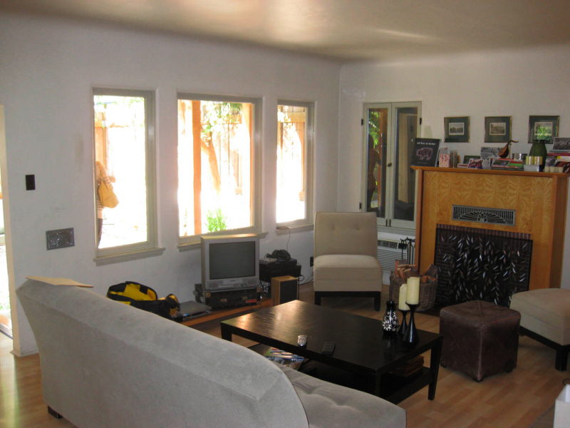
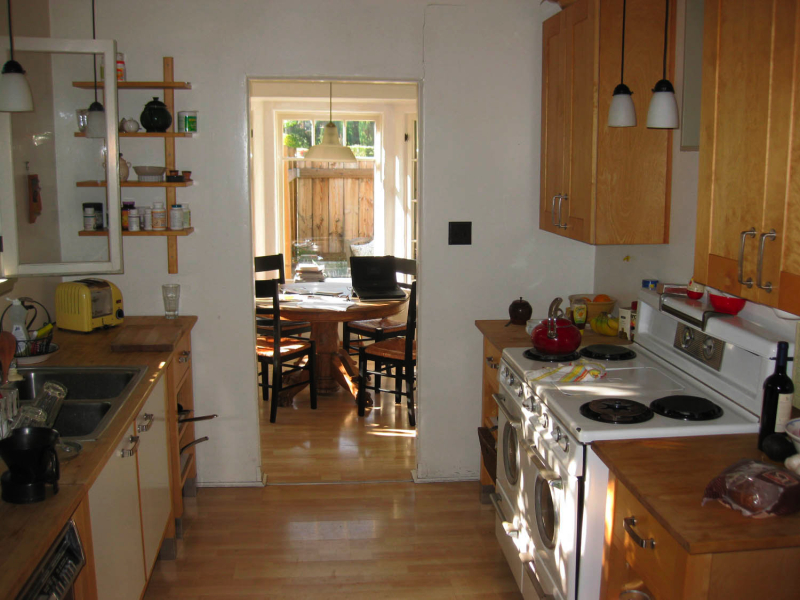
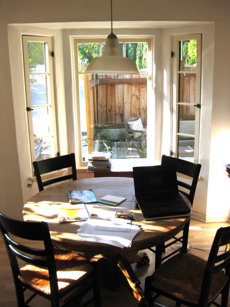
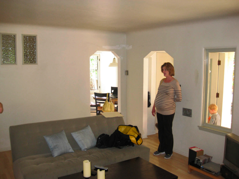
Tucked away in the hills over Los Angeles in the community of Silver Lake, the owner of this 1930’s era home is looking to renovate the living area to include the kitchen, dining and living rooms. Since these rooms are clustered on the north side of the house, they tend to be dark. Also, the three rooms are disconnected from each other, small and not suitable for hosting social events. Lastly, the owner would like to increase the ceiling height in the living room to give the room a greater sense of volume. The design challenge is to address all of these conditions.
Proposed Design
This project exemplifies why it is appropriate for each design challenge to be addressed individually – DESIGNlinkup and owner went through nine different concepts adjusting different parameters and variables until we got it right. We will show you three process concepts followed by the final concept.
Concept 1
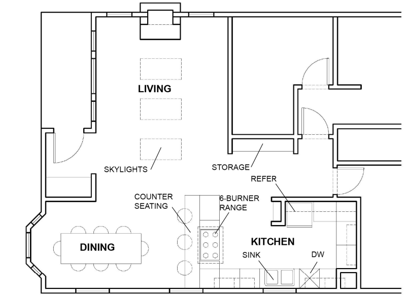 Above is the first idea we looked at. The wall separating the kitchen and dining area from the living room has been removed. The position of the utilities in the kitchen has been rearranged. Notice that in order to make the kitchen larger, the area previously used for the full bath has been converted to kitchen space. DESIGNlinkup proposed using closet space in bedroom 2 as a possible power room to replace the bathroom.
The upsides to this option are:
1) The kitchen and dining space became much larger, and there is now a clear connection between the kitchen, living, and dining room.
2) In the kitchen, a triangular relationship between sink, range, and refrigerator is established that works for food preparation flow.
3) The refrigerator is removed off of the exterior wall which previously was in front of a window.
4) There is room for 8 people to comfortably sit at the dining table.
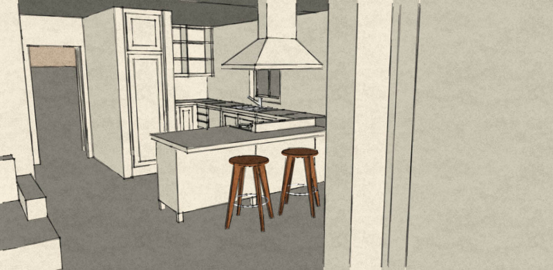
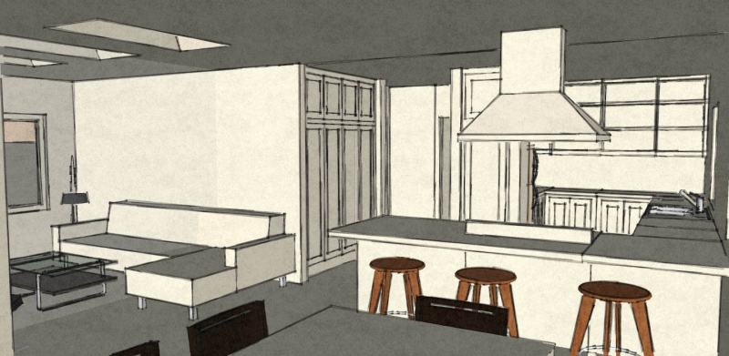
5) There is also room for three people to sit at the bar.
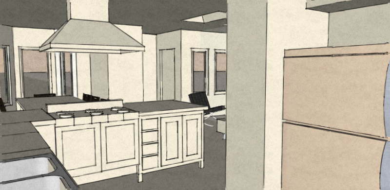
6) The range faces the dining and living rooms, to allow the owner to be cooking and still part of the activity in the dining and living rooms during social events.
All these features are great, however this was just a start.
The downsides to this options are:
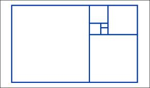
1) The kitchen and dining space have an awkward ratio of width to length. The space feels cavernous because the length to width ratio is so far away from the golden mean (1:1.618)
2) Loss of the bathroom discussed above.
3) The relationship between rooms is unresolved. There are no implied boundaries between rooms. Thus the space would feel like one big room. Although the owner seeks more open and larger volumes, spatial definition and boundaries should be sought.
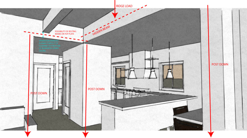
4) Due to structural restrictions, large beams would be required to span the clearances. There is not enough room in the attic to accomplish the depth of beam required to accomplish these spans. A post would be required. Further concepts incorporate this requirement.
5) The ceiling is shown as one plane (with skylights to bring light into the living room) contributing to the #3 above.
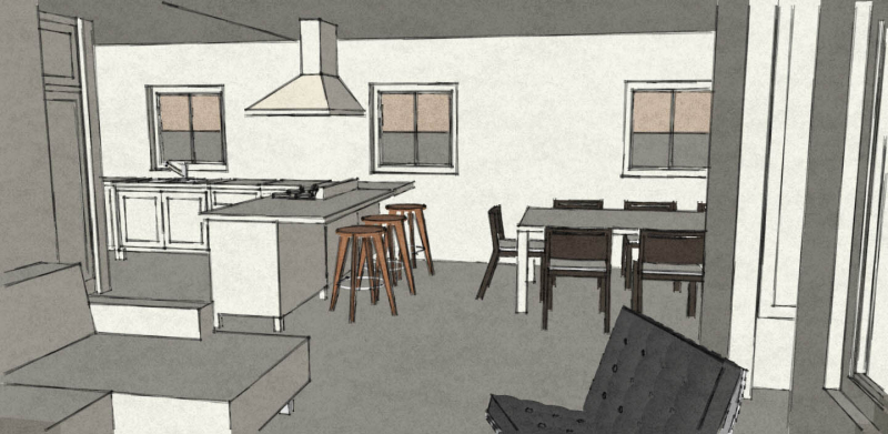
Here are some images of the imagined space:
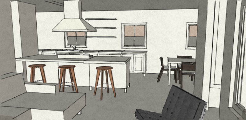
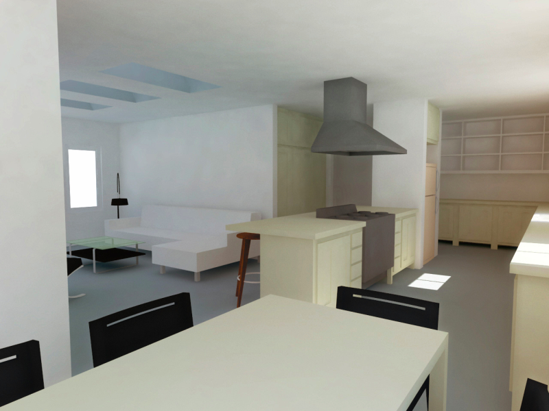
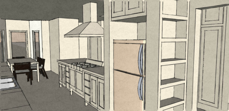
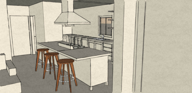
Concept 2
Similar to concept 1 however here we rotate the bar parallel to the hallway and provide a secondary access point into the kitchen.
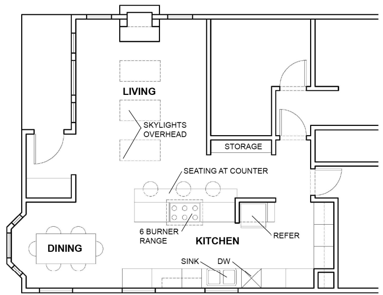 The upsides of this concept are:
1) Better flow through the kitchen with the addition of the second access point into kitchen off the hallway.
2) The rotated bar helps separate the kitchen/dining area from kitchen but at the same time maintains a visual connection between the two areas.
3) The proximity between refrigerator, sink and range is good. There is a lot of surrounding counter space.
The downsides of this concept are:
1) As seen in the images below, the placement of the range now makes it a focal point from the entry.
2) The kitchen/dining area are still very long.
Here are some views of the imagined space:
Concept 3
The next concept we investigated left that Bathroom space intact. The differences between this and concepts 1 and 2 are significant.
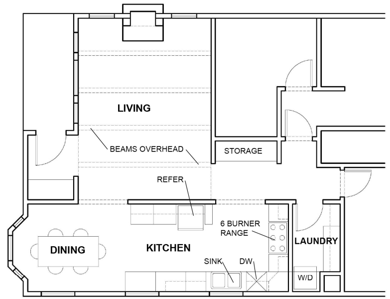 The upsides to this option are:
1) Compared to the existing condition, there is more visual connection between the kitchen/dining areas and the living room. There is definitely more of a connection between the kitchen and dining area -it’s essentially the same room.
2) A laundry room is created where the bathroom was to suit the owner’s needs.
3) Compared to concepts 1 and 2, structural loads are addressed.
4) Living room volume expands vertically with a ceiling that is 12″ higher than existing condition. This begins to give the Living Room an implied sense of unique space.
The downsides of this option are:
1) The dining room space is smaller than options 1 and 2. Still manageable though.
2) Even though the kitchen/dining area are more connected to the living room than existing conditions (which are mere doorways), there’s still opportunity to connect the spaces more. The spaces should have their own identity, but yet feel connected and interwoven. This relationship does not exist yet.
3) The “activity” nodes of the kitchen are oriented towards the corner of the kitchen farthest away from the social rooms.
4) The kitchen is not efficient. The passageway to the hallway is wide and wasted space in this small house. The kitchen should be more compact and in scale with the rest of the living space.
Here are some images of the imagined space:
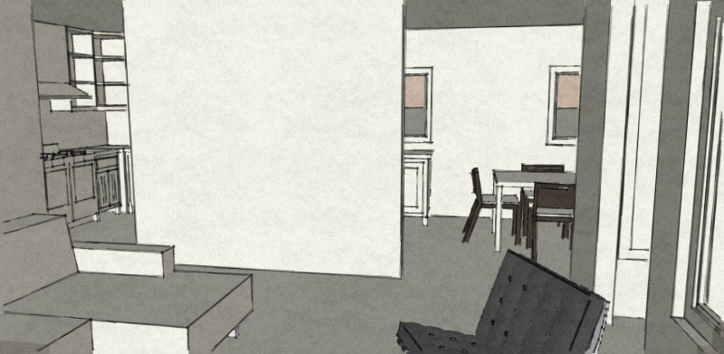
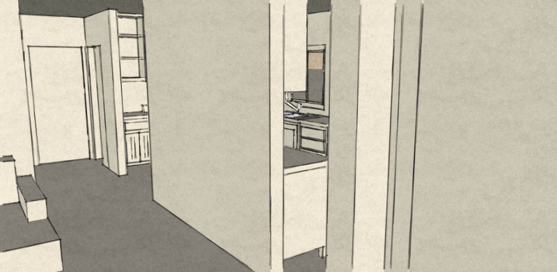
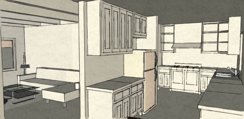
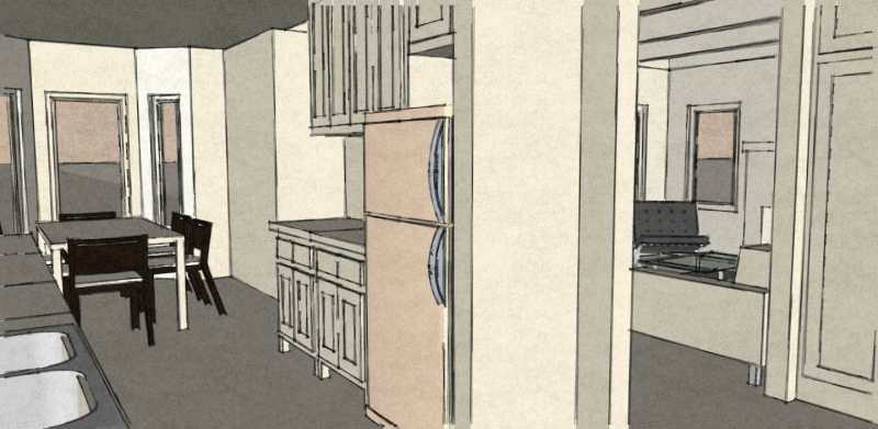
Final Concept
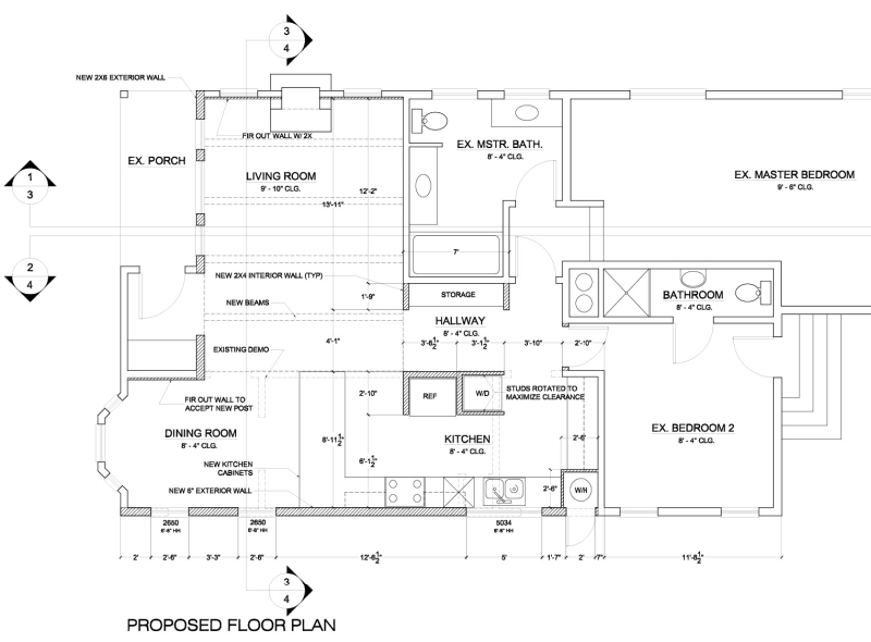
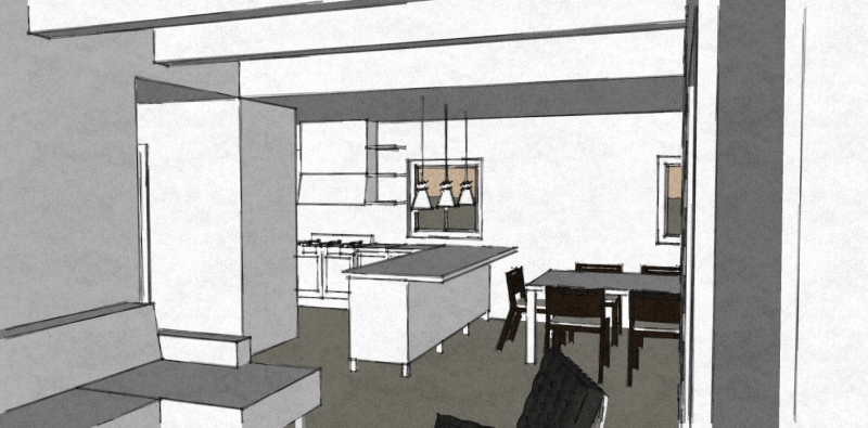
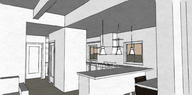
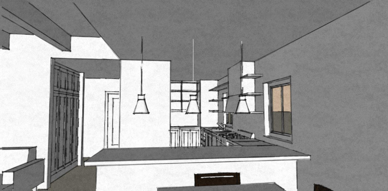
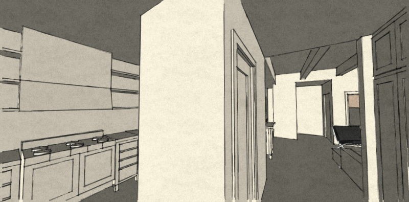
The final concept fuses several of the high points from previous concepts with some new ideas. In the plan diagram below, the dark hatch refers to new walls. Here’s what we did:
1) We eliminate the need for a full laundry room as tested in concept 3 and place a stack washer and dryer in the kitchen, but out of sight. It is just off the hallway corridor. A bathroom is built into the closet space of bedroom 2.
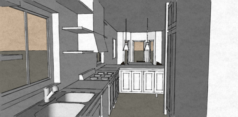
2) Let’s take a look at the new kitchen, moving clockwise from the washer and dryer. Direct access from the hallway and master bedroom. This allows daylight into the hallway that comes in through the kitchen windows. On the side side of the kitchen is room for a large pantry or lower and upper cabinetry. A large viewing window is placed above the new sink on the west wall. The dishwasher is next to the sink. The range is positioned next to the dishwasher. On the north side, a counter faces the dining room providing an implied separation and more counter space to work with. On the east side, the refrigerator sits next to the washer and dryer but facing the kitchen space of course. The walls around the refrigerator are important because they contain an important structural post. Also, north wall surrounding the refrigerator is significant because it is in line with the plane of the adjacent living room. This gives the impression of the wall plane of the living room passing into the kitchen giving the sense of the two spaces being interwoven. This alleviates the challenge of the spaces seeming to be simple volumes placed next to each other, rather introduces a sense of complexity and interdependence.
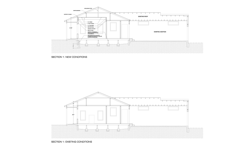
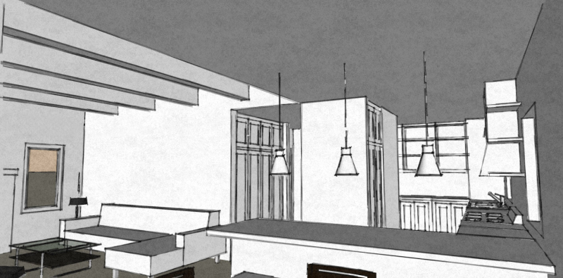
3) In the living room, the ceiling height was raised and lined with beams. This gives the room a greater sense of volume and helps preserve its identity even though the western wall of the room was eliminated.
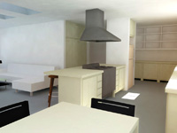
 Below are images of the imagined space. The final drawings reconfigured the windows along the west wall. The images below show two windows in the kitchen. The final drawings reflect one window in the kitchen over the kitchen sink. Two windows are placed on the dining room west wall (not seen in images below). The images below also show the washer/dryer accessed off the hallway. The final drawings place the stack w/d unit rotated 90 degrees.
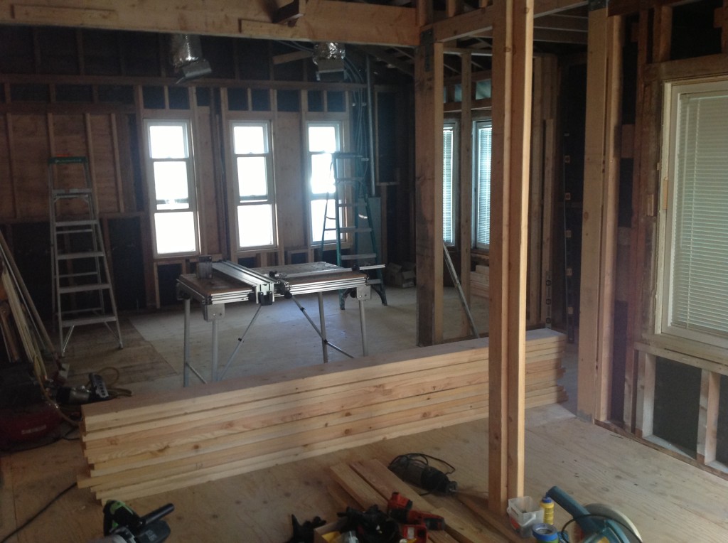
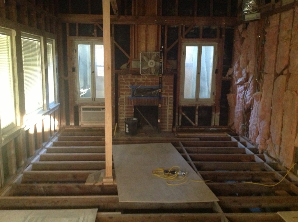
Construction photos…
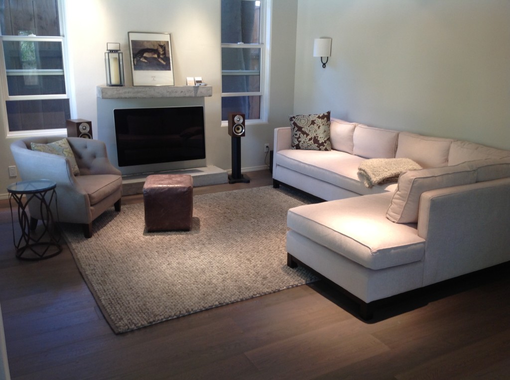
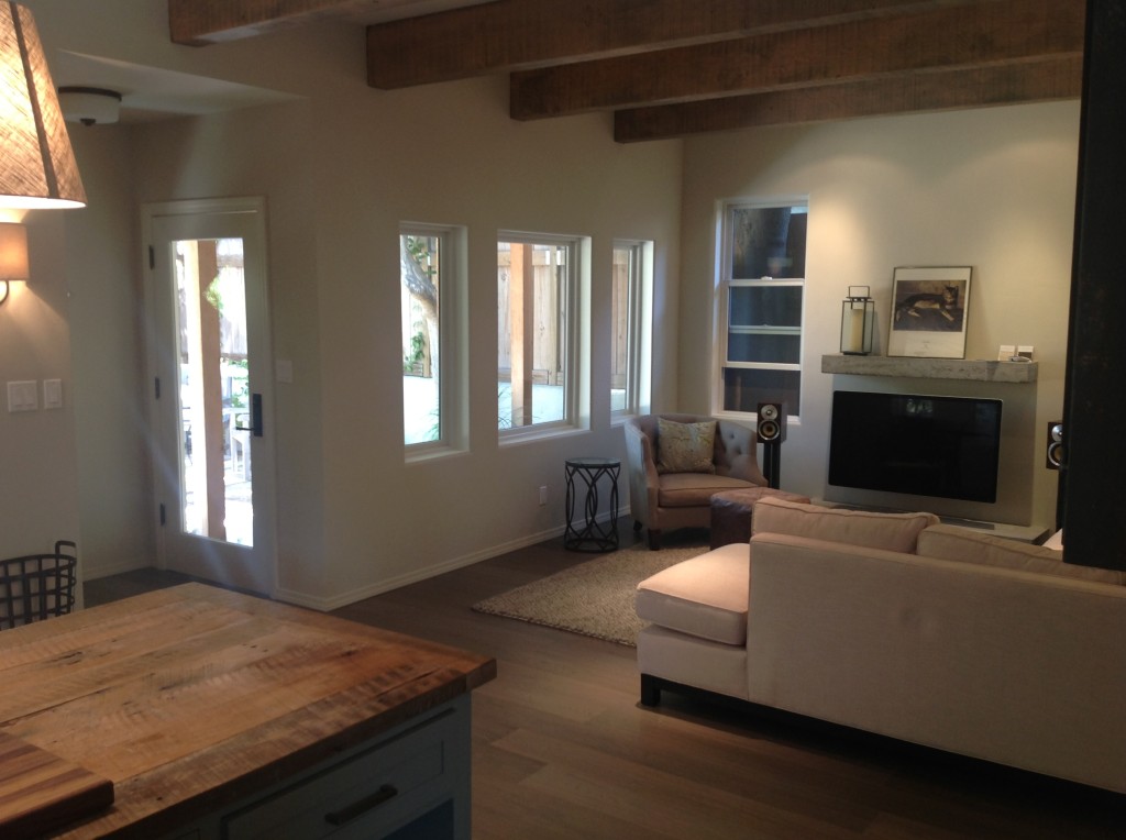
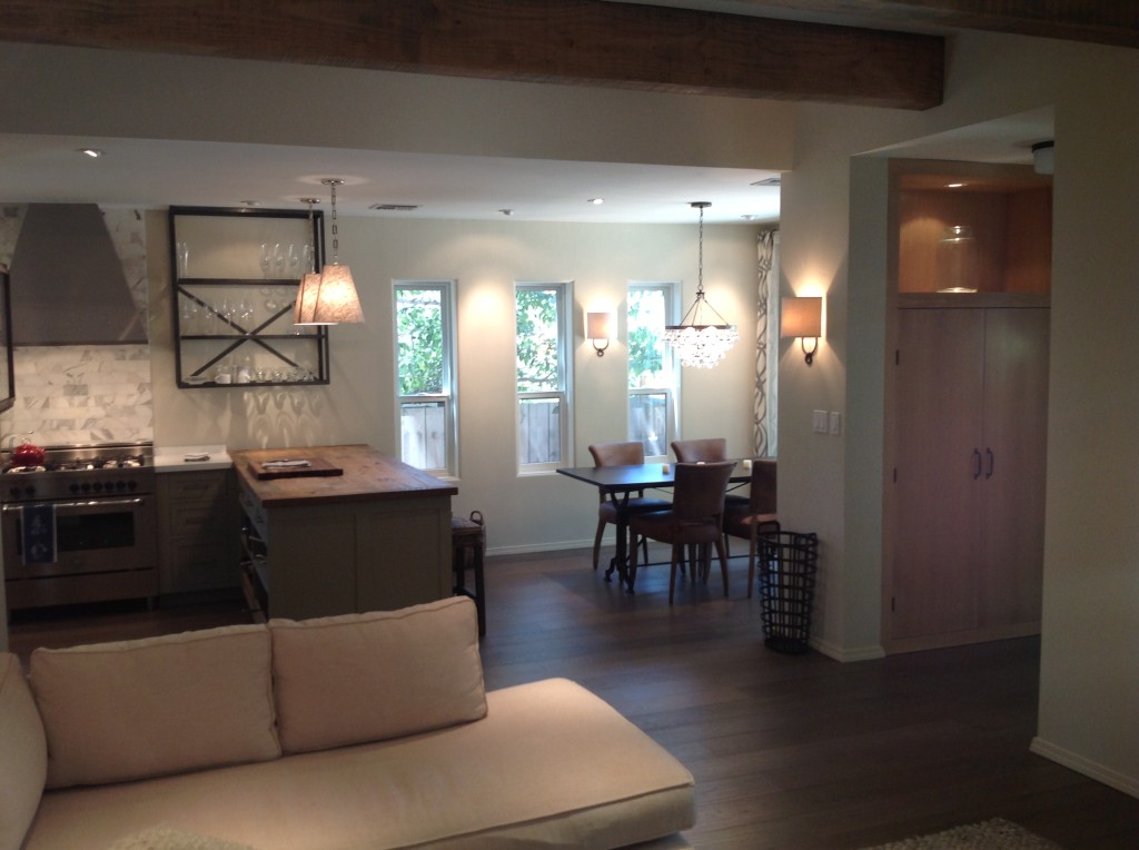
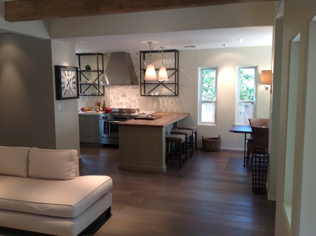
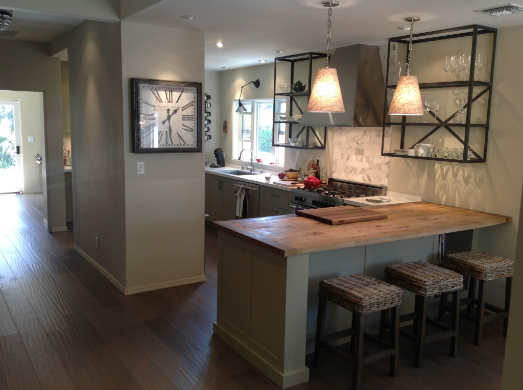
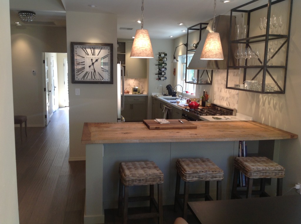
Finally.. we see the space after construction is finished. What a transformation! The house feels so much larger and has wonderful flow.
Note: The production of construction documents for this project was part of a fee-based package. The owner worked with a Structural Engineer and Interior Designer to specify the details for this project.
Great design for an eclectic residential area of Los Angeles – I especially like the focus on the parts of the house where the occupants spend most of their time.
As the owner, I just wanted to add a few words. Working with Designlinkup was a life saver given the finite amount of space we had to work with. One major solution was how Marc came up with of were to put the main kitchen appliances. At the intersection of the living room, hall and kitchen is the enclosure for the washer/drier and fridge. We installed a smaller European washer/drier and cabinet depth fridge resulting in more working space in the kitchen. This ultimately solved the space problem and seems now to be such an elegant although simple solution… This proves the necessity of working with a creative architect willing to go the extra mile.
Liked Option 2 the best. Final scheme overlaps kitchen zone with Living room zone making dining – brilliant!